Automobili Lamborghini Renews Its Logo & Introduces New Corporate Identity After 20 Years
After more than two decades of announcing its last update, Automobili Lamborghini has revamped its logo and introduced a new identity which is driven by a new strategy to better reflect the ‘brave’, ‘unexpected’ and ‘authentic’ values of its mission-‘Driving Humans Beyond’.
After announcing its last update more than two decades back, Automobili Lamborghini has introduced a new brand identity and revamped its iconic bull logo. The same will be used on all the company’s official channels.
This revamp is driven by the automobile major’s new strategy which involves adapting the brand’s visual expression to better reflect the “brave”, “unexpected” and “authentic” values of its mission, namely “Driving Humans Beyond”, a concept that translates into the intention to always go beyond the limits, standards and conventions.
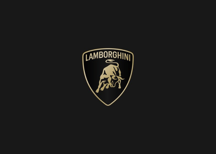
As per the automobile major, the new logo is redefined by a broader Lamborghini typeface than its predecessor and by colors that are minimal yet bold. Therein, the two colours- black and white are reconfirmed as the primary hues, symbolising the clear identity of the brand and yellow, along with the introduction of gold color, is used as the accent color.
This revamped version of the logo becomes an integral part of not just the company’s distinctive identity but will also be applied on the brand’s future cars as well.
In addition, the iconic bull in the center of the logo has undergone a major transformation and it is for the first time that the same will exist individually on the company’s digital touchpoints, separated from the classic shield to lend it even greater prominence.
That being said, the change will also extend to all manifestations of the brand including the fact that an official Automobili Lamborghini typeface has been created to echo the unmistakable lines and angularity of the cars, in line with the style and design of the Sant’Agata Bolognese-based company. The same will be used for the company’s communications.
As per the brand, the redesign also includes a new set of icons, developed in collaboration with Lamborghini Centro Stile, that for the first time will be used and shared uniformly across all the digital touchpoints.
Moreover, this evolution is part of the brand’s broad transformation process- ‘Direzione Cor Tauri’ which is a strategy that embodies Lamborghini’s new trajectory focused on sustainability and decarbonization, driven by the aim to create a solid pact with the future generations and serve as an inspiration and model for innovation and sustainable progress.
Keeping the aforementioned transformation process in mind, the House of Sant’Agata Bolognese is implementing changes that involve not only the cars, but the corporate identity as a whole, and thereby impacting the company’s culture and values, which will also see a new expression in terms of all the visual aspects.
In a rapidly changing context, Automobili Lamborghini looks to the future with a redesigned logo that embodies innovation and determination. It’s a strategic change that perfectly complements the holistic shift outlined by the Direzione Cor Tauri program, marking a new phase in the company’s positioning.
Author
A content writer with a focus on marketing psychology, brand communication, and consumer behaviour across African markets. He contributes to Brand Envoy Africa’s thought leadership, exploring how brands can build trust, drive engagement, and create culturally relevant narratives in a rapidly evolving digital landscape. His work centres on simplifying complex marketing ideas into practical insights for businesses, entrepreneurs, and growth-focused organisations.
